I’ve long been an admirer of the older street signs in Los Angeles.
They emit the characteristic and regional style of a time and place. Their lettering is crisp, stylized, and easy to read.
According to this LA Times article, the city began to produce the distinctive shotgun shaped, dark blue porcelain, metal signs in the 1920s.
As the city grew, in the 1930s and 40s, the signs became markers of urbanism, uniting the vast region under a single style.
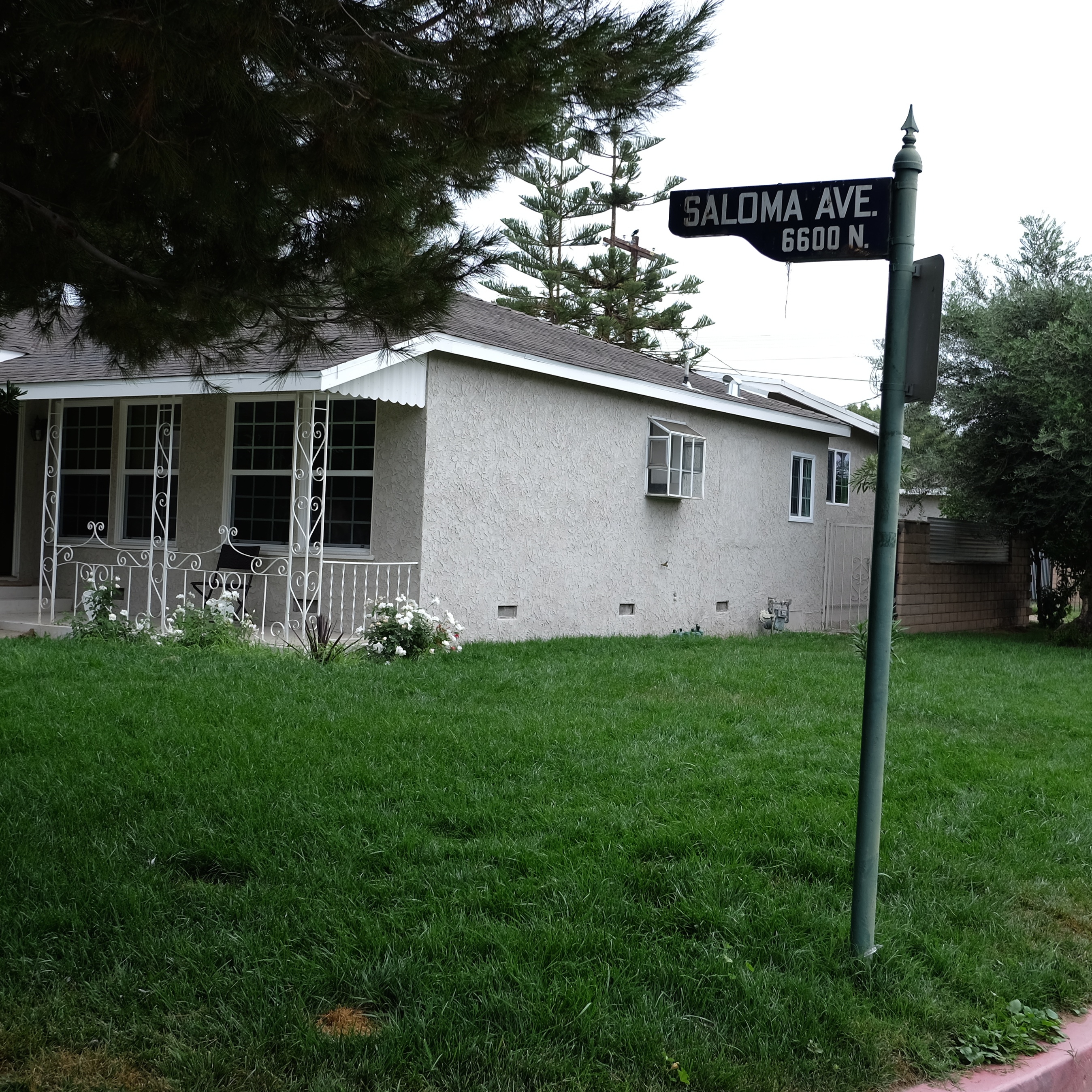
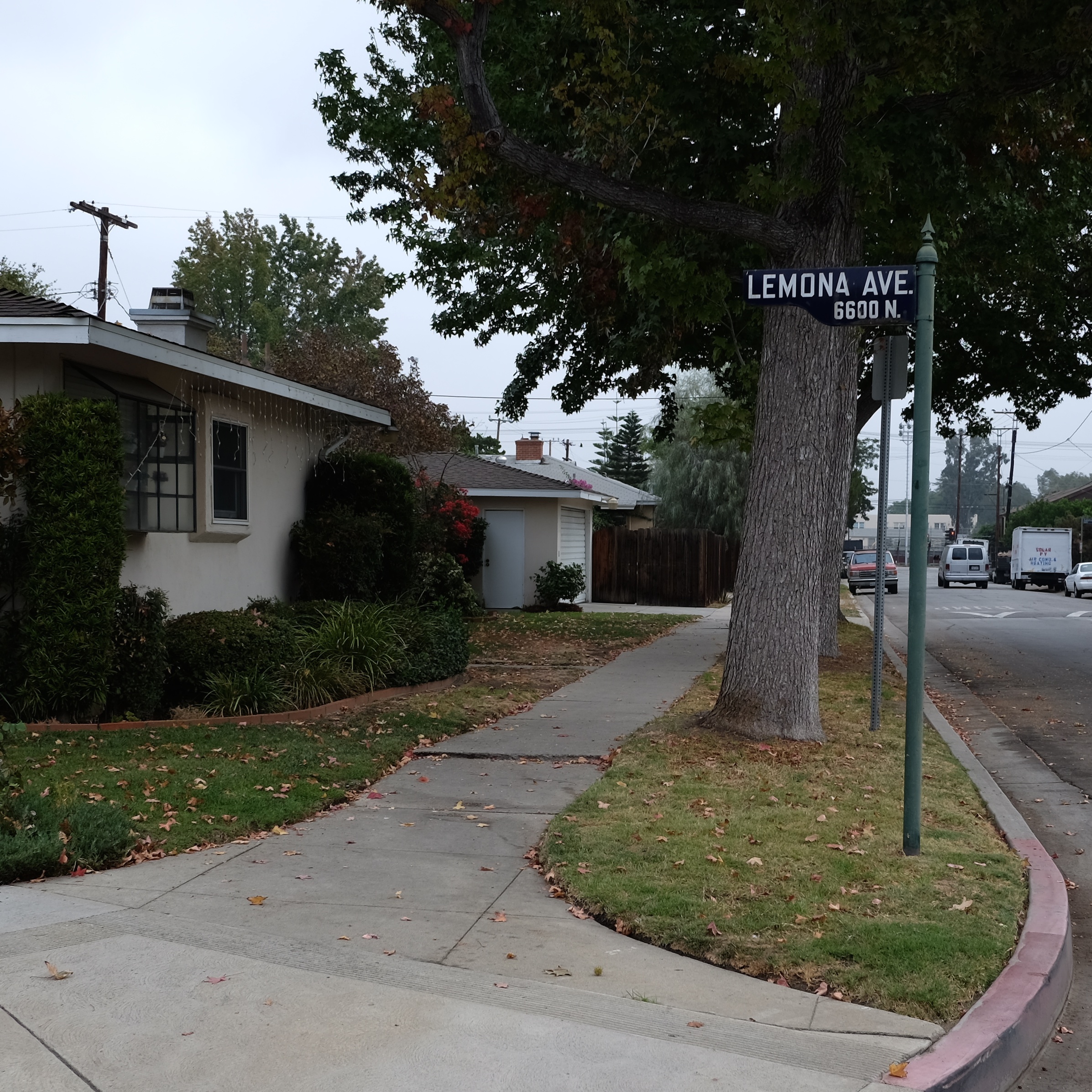
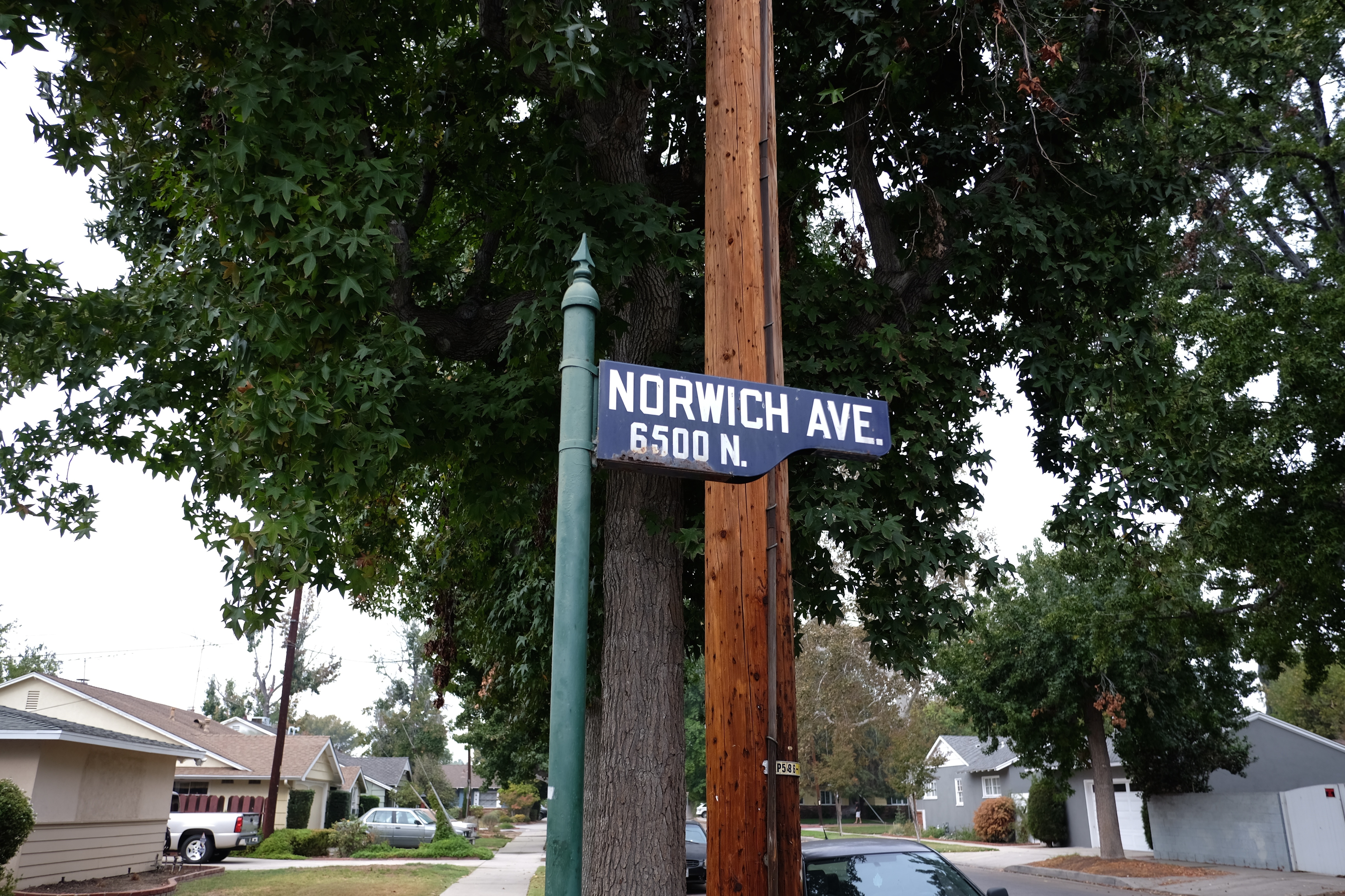
Along Kittridge Street in Van Nuys, near where I live, I found this poetic sounding trio of survivors: Norwich, Lemona and Saloma.
Metal poles with decorative finials add elegance.
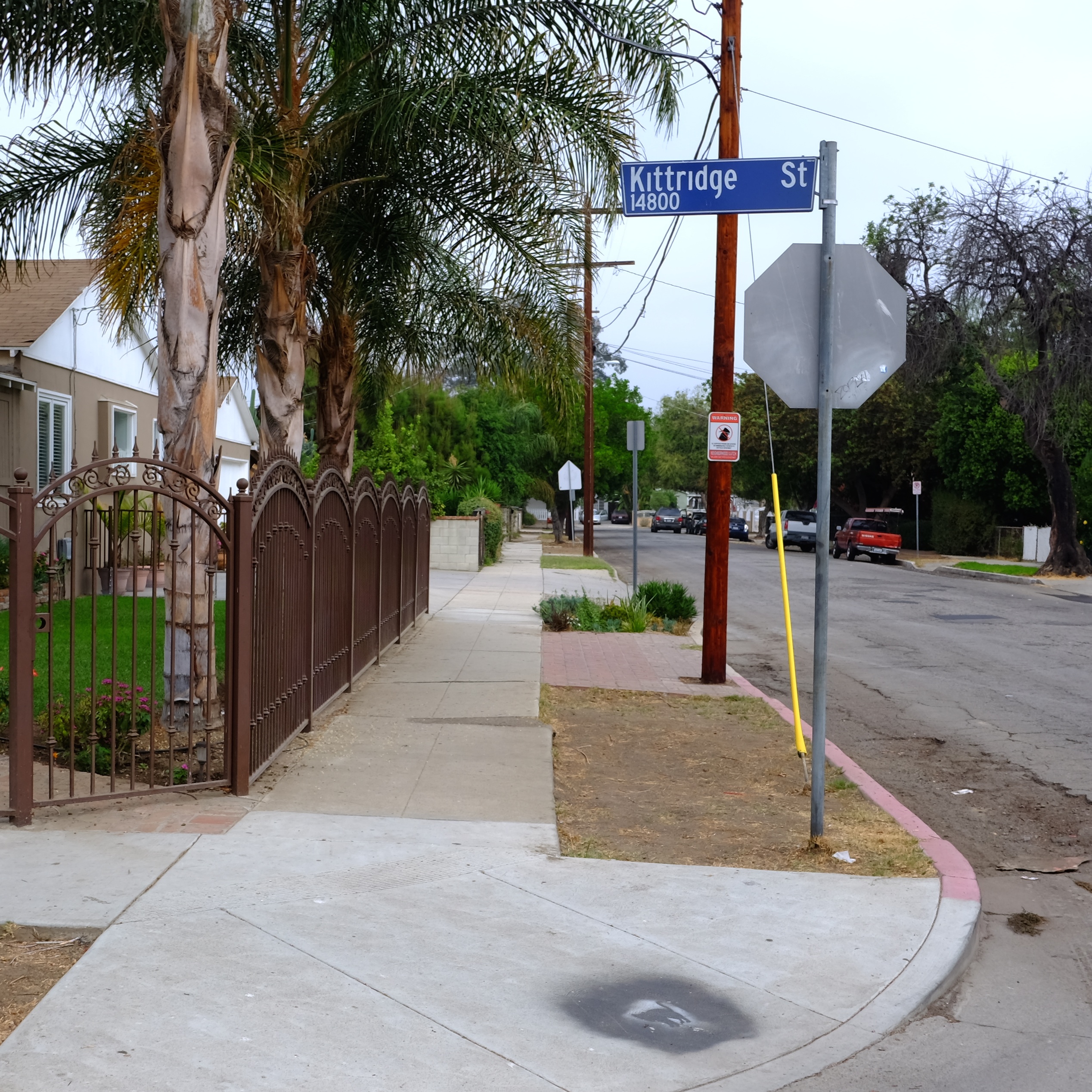
Further east on Kittridge, a newer sign, in medium blue, looks cheaper and functional. It is attached to a plain metal pole.
It does its job, like a vinyl replacement window in an old house.
But a public sign should, in a civic sense, not only shout out a name, but do it with a flourish, and a sensibility.
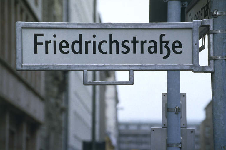

Imagine Berlin or San Francisco without their unique street signs.
The old sign makers understood that we as a city are lost without proper signage.
